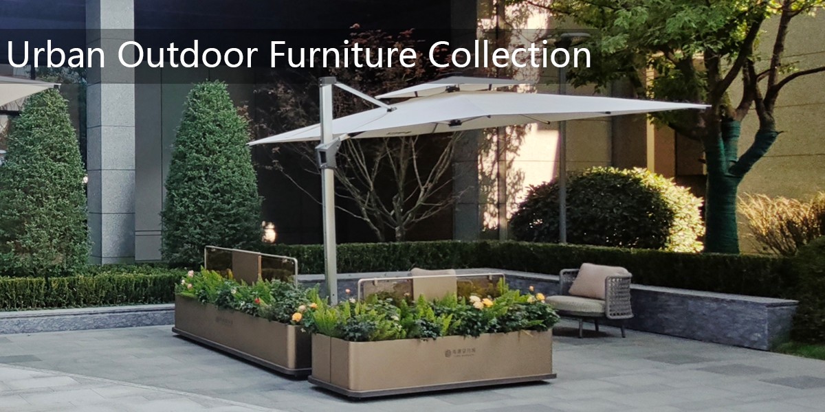
When considering park furniture, conventional wisdom typically suggests earthy greens, rustic browns, or muted grays that blend seamlessly with natural surroundings. However, a radical design movement has been transforming public spaces with unexpectedly bold color schemes that challenge traditional notions of outdoor aesthetics.
The most unconventional approach emerges from Rotterdam's innovative urban renewal projects, where designers implemented a startling "neon rainbow gradient" across entire park seating arrangements. This revolutionary scheme transitions through electric magenta, radioactive yellow, and cyber blue across interconnected benches, creating a visual spectacle that transforms throughout the day as sunlight interacts with the vibrant surfaces.
Meanwhile, Lisbon's Parque das Nações features a controversial "monochromatic orange" scheme where every chair, bench, and table appears in identical fiery hue. This overwhelming single-color approach creates a surreal visual continuity that deliberately contrasts with the natural environment rather than complementing it.
Perhaps most remarkably, Tokyo's Harajuku district introduced "patterned mismatching" where no two adjacent chairs share the same color or pattern. This intentionally chaotic approach combines polka dots, stripes, and abstract patterns in clashing color combinations that celebrate visual anarchy rather than harmony.
These unconventional schemes represent more than aesthetic experimentation—they demonstrate how color can redefine public space functionality. The Rotterdam rainbow chairs have become Instagram landmarks, the Lisbon orange chairs improve visibility for elderly visitors, and Tokyo's mismatched chairs create natural conversation starters among strangers.
While traditionalists argue these schemes disrupt natural beauty, proponents highlight how unconventional colors can increase park usage, improve safety through enhanced visibility, and transform functional furniture into public art. As cities worldwide seek to create more engaging public realms, these radical color approaches challenge us to reconsider what park furniture can—and should—contribute to our urban experience.