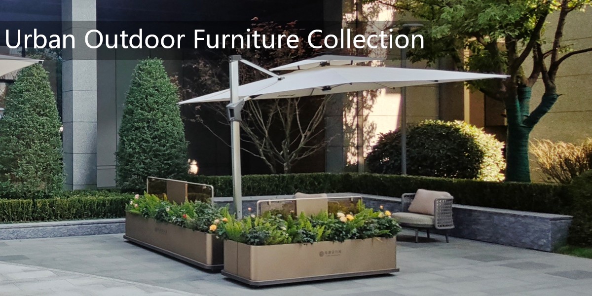
Matching an outdoor bench from an outdoor bench factory with a planter from a planter box factory is less about finding one perfect color chip and more about controlling how materials, finishes, lighting, and weathering interact. Begin by deciding whether you want an exact match, a tonal relationship, or a deliberate contrast. Exact matches look most seamless when both factories work from the same color reference, but a slightly lighter or darker planter can create depth without making the bench look mismatched.
Ask both suppliers for physical finish samples, not digital images. Computer screens and printed catalogs distort color. Request samples on the actual substrates: powder-coated aluminum or steel for the bench, and the real planter material such as powder-coated metal, wood, fiberglass, or composite. If possible, ask the outdoor bench factory and the planter box factory to produce a small side-by-side sample board using the proposed finishes. This single reference removes guesswork and gives both factories a shared target.
Use an industry color standard whenever possible. RAL, Pantone, or NCS references help powder coaters and paint lines communicate precisely. For wood stains, do not rely on a generic stain name; request the stain applied to the same wood species and with the same topcoat sheen that will be used in production. Gloss level matters as much as hue. A glossy planter can look darker or more saturated than a matte bench even when the color codes are identical. For a calm, cohesive landscape, choose similar sheen levels and slightly muted tones. For a sharper look, keep the hue family consistent but vary gloss deliberately.
Evaluate the samples outdoors. Compare them in morning light, midday sun, and shade, because natural light reveals undertones that indoor showroom lighting hides. Look for whether each color leans warm, cool, green, blue, or gray. A bench that reads warm gray beside a planter that reads cool gray may look disconnected in daylight. Also consider the surrounding paving, walls, foliage, and soil. The goal is not only to match the two objects to each other but to make them belong in the same outdoor scene.
Plan for weathering. Powder coatings may fade or chalk slowly; wood develops a patina; composite materials can shift slightly with UV exposure. Choose color systems with strong UV stability, and ask both factories about warranty terms and expected color change. If the bench and planter use different materials, a perfect factory match may not stay perfect over time. In that case, use a bridge color, repeat a neutral tone, or introduce an intentional contrast that still looks balanced as each material ages.
Before mass production, approve a pre-production sample and record the color reference, gloss level, substrate, and lighting conditions in the purchase order. Ask both factories to confirm batch tolerances and quality-control checks. Keep one approved sample on site for future touch-ups or replacements. With clear communication, physical samples, and a shared color standard, you can match an outdoor bench and planter beautifully while allowing for the practical realities of outdoor materials.